Not a lecture. Not a crash course.
A pure skill-building sprint — after this, you'll actually do cohort analysis, not just vaguely know what it is.
No Cohorts — No Promotion. No Visibility.
The practice-only workshop every future seniors or CMO & CPO needs and for founders who refuse to fly blind.
This action-based lesson is designed for Product Managers and Marketers who master LTV, User Retention, Revenue Retention, and Conversion Rates but are ready to step into P&L and unit economics. The reality of the modern market is simple: without a deep, practical command of cohort analysis, advancing to a Senior, CPO, or CMO role is nearly impossible. In data-driven organizations, mastering cohorts isn't just an advantage; it’s your seat at the table.
The lesson consistently demonstrates methods for building cohorts, the relationship between dates and periods, and the formulas. Real scenarios for evaluating cohort metrics are shown.
Where and when would cohort analysis be useful
Sometimes there's no time to study — you need to give an answer right away.
Sometimes no one else will find the right answer (no analyst on the team).
At a board meeting they ask you to explain why LTV is dropping — and you don't understand where the numbers come from.
In a Senior-level interview they ask about cohort analysis — and you're lost.
Marketing is pouring in traffic, but conversion to active users is dropping — where's the problem?
The analyst is overloaded; waiting a week is not an option.
Companies are looking for PMs who "think like analysts": write SQL themselves, understand cohorts, build dashboards.
The founder gets it: "I need to understand my own data while the company is still small."
The only analyst left, and the reports were needed yesterday.
The CEO/investor asks to "show retention by cohorts" — and you can't.
Early-stage startup — no budget to hire an analyst.
Retention is flat, but it's unclear — is that normal or a disaster?
You should absolutely must use cohorts. No more blind blended reports.
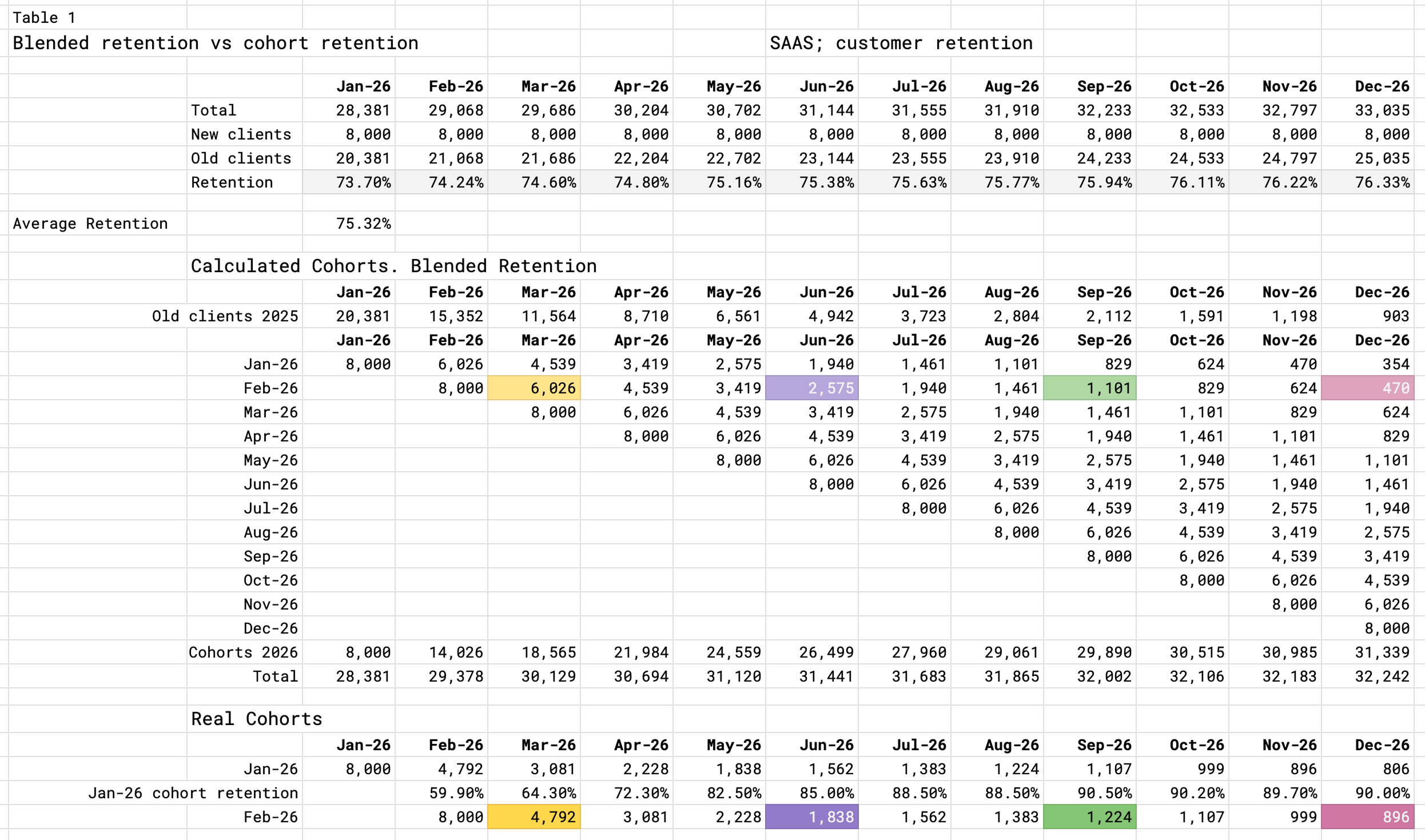
Blended metrics are blind. Let me show why. Let's look at the example of customer retention. The table shows the number of customers and the retention rate for each month. It's a simple table, but it can be used to understand the retention rate for each month.
This is a standard report that the marketing or product team provides to the CEO or investors. It shows how many users have remained in the product each month.
| 2026 | Jan | Feb | Mar | Apr | May | Jun | Jul | Aug | Sep | Oct | Nov | Dec |
|---|---|---|---|---|---|---|---|---|---|---|---|---|
| Total | 28,381 | 29,068 | 29,686 | 30,204 | 30,702 | 31,144 | 31,555 | 31,910 | 32,233 | 32,533 | 32,797 | 33,035 |
| New | 8,000 | 8,000 | 8,000 | 8,000 | 8,000 | 8,000 | 8,000 | 8,000 | 8,000 | 8,000 | 8,000 | 8,000 |
| Old | 20,381 | 21,068 | 21,686 | 22,204 | 22,702 | 23,144 | 23,555 | 23,910 | 24,233 | 24,533 | 24,797 | 25,035 |
| Retention | 73.70% | 74.24% | 74.60% | 74.80% | 75.16% | 75.38% | 75.63% | 75.77% | 75.94% | 76.11% | 76.22% | 76.33% |
The table above doesn’t show who joined when or from which channel. Each line below is a plausible story — there is no “wrong” tap. When both sides of a pair are selected, a short note appears. On the lesson we split by month of first signup and by source (cohorts).
| 2026 | Total | New | Old | Retention |
|---|---|---|---|---|
| Jan | 28,381 | 8,000 | 20,381 | 73.70% |
| Feb | 29,068 | 8,000 | 21,068 | 74.24% |
| Mar | 29,686 | 8,000 | 21,686 | 74.60% |
| Apr | 30,204 | 8,000 | 22,204 | 74.80% |
| May | 31,144 | 8,000 | 23,144 | 75.38% |
| Jun | 31,555 | 8,000 | 23,555 | 75.63% |
| Jul | 31,910 | 8,000 | 23,910 | 75.77% |
| Aug | 32,233 | 8,000 | 24,233 | 75.94% |
| Sep | 32,533 | 8,000 | 24,533 | 76.11% |
| Oct | 32,797 | 8,000 | 24,797 | 76.22% |
| Nov | 33,035 | 8,000 | 25,035 | 76.33% |
| Dec | 33,035 | 8,000 | 25,035 | 76.33% |
| 2026 | Total | New | Old | Retention |
|---|---|---|---|---|
| Jan | 28,731 | 8,000 | 20,731 | 75% |
| Feb | 29,548 | 8,000 | 21,548 | 75% |
| Mar | 30,161 | 8,000 | 22,161 | 75% |
| Apr | 30,621 | 8,000 | 22,621 | 75% |
| May | 46,966 | 24,000 | 22,966 | 75% |
| Jun | 59,225 | 24,000 | 35,225 | 75% |
| Jul | 68,419 | 24,000 | 44,419 | 75% |
| Aug | 75,314 | 24,000 | 51,314 | 75% |
| Sep | 80,486 | 24,000 | 56,486 | 75% |
| Oct | 84,365 | 24,000 | 60,365 | 75% |
| Nov | 87,274 | 24,000 | 63,274 | 75% |
| Dec | 89,455 | 24,000 | 65,455 | 75% |
Cohort analysis helps avoid mistakes in management decisions
Without cohorts, it is easy to misinterpret your metrics and make wrong management decisions:
- start scaling an ad campaign that will generate losses
- keep a feature that kills your metrics
- miss a segment you should focus on.

Blended metrics are blind. Let me show why
What you will learn
The goal of this lesson is to teach you how to correctly evaluate metrics that reflect reality only when calculated by cohorts: LTV, Revenue Retention, User Retention, Customer Retention, Conversion Rate, ARPPU, AOV, APC. For a specific period, you will be able to see that something has gone wrong with new users and understand which hypotheses delivered results. In total, there are more than 100 scenarios.
I will give recommendations on how to communicate these ideas to stakeholders.
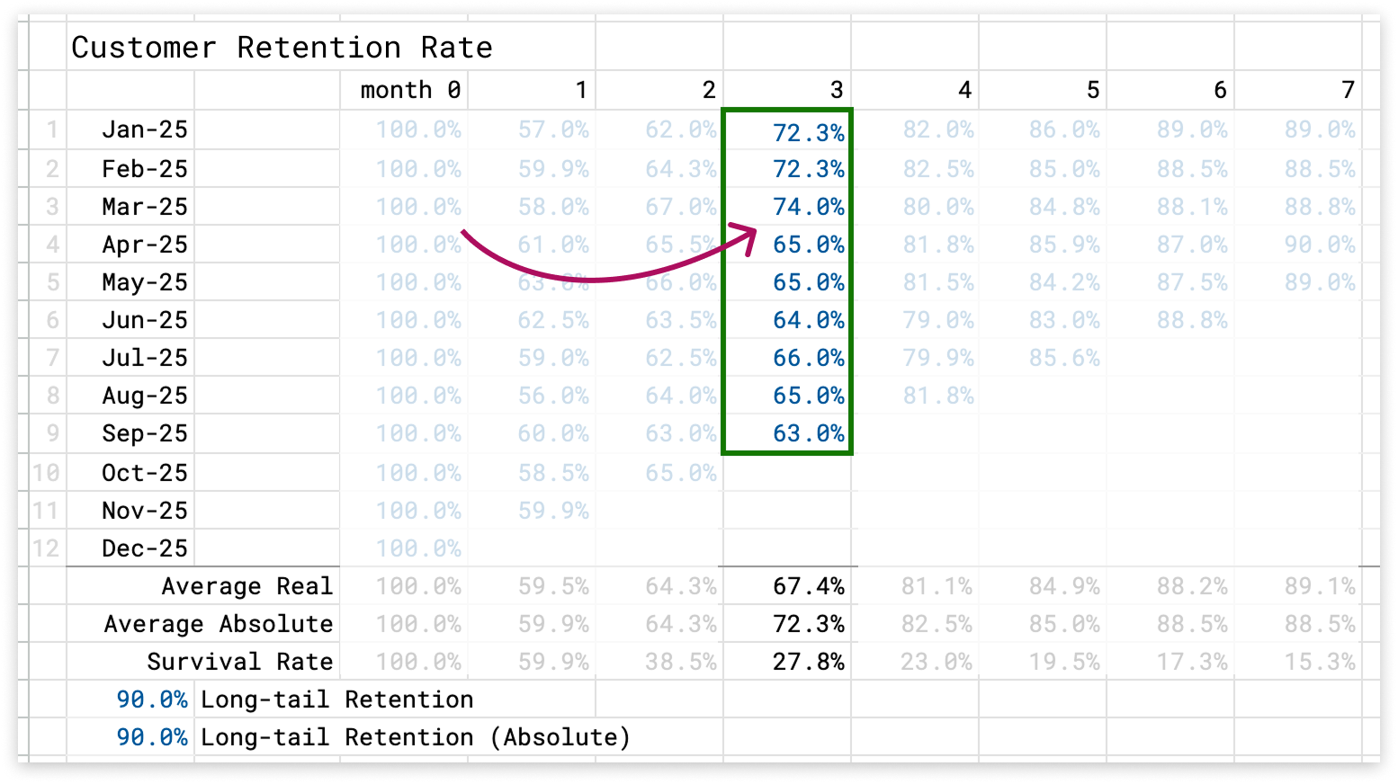
Cohort analysis shows that starting from April, something broke in the third month of the life cycle of all subsequent cohorts. It is possible that renewal notifications for the subscription stopped working.
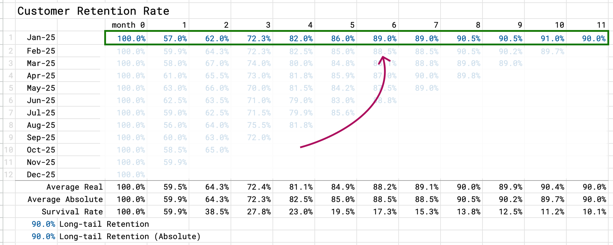
We look for the period when retention stabilizes, when only loyal customers remain. Starting from month 6 for the January cohort, approximately 90% of customers return in all subsequent months without sharp changes in the metric.
Let's configure your lesson. Choose the metric you focus on
The lesson will be tailored to this metric. But you can get tasks for other metrics too. I also recommend completing all tasks to train your thinking on cohort tables. Practice is what delivers results.
You work in
Lesson structure
This is not a typical lecture but a substantial lesson with theory and practice. It is more like a master class or simulator. Students watch 9 videos and complete 12 practical tasks where they learn about "scenarios, mistakes, metrics".
The 3 hours of theory are split into 20‑minute blocks. Learn whenever it is convenient for you — progress is saved. It is clear that 3 hours at once is hard to get through. The practice should be done on a desktop, as it uses spreadsheets. And it is also preferable to watch the videos there.
- Block 1: Why cohort analysis is needed.
- Block 2: How cohorts are built, with an example.
- Block 3: The cohort's basis.
- Block 4: Left‑aligned and right‑aligned cohort tables.
- Block 5: Which metrics are cohort metrics?
- Block 6: Cohort analysis methods: vertical, horizontal, diagonal.
- Block 7: Visualization on charts.
- Block 8: Cohorts with a long sales cycle.
- Block 9: How to build a pivot table from raw data.
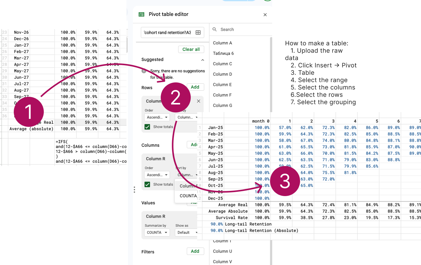
In this practical assignment, students learn how to group raw data into a cohort table.
What you will get with the lesson:
- Google Sheets templates (we practice in Airtable, but everything is the same).
- Instructions for filling them in
- Requirements for analysts for setting things up in Power BI
- Templates for presenting results to management
- Action plans.
Action plan
The main thing you will get after the lesson is action plans for working with Retention and for working with Acquisition.
The action plan for Retention includes a plan for Net Revenue Retention, Customer Retention, User Retention, cohort segmentation, and Power BI instructions.
The action plan for Acquisition includes C1, channels, long sales cycle, Power BI instructions, and the sales funnel.
About the author

"When I started working as Head of Product, the first thing I did was build a cohort analysis of retention. Within a week, we found three critical churn points and increased retention by 23%. Cohorts are a tool that works every day."
My experience:
✓ 9 years in Product Management
✓ Specialization: Growth, Retention, data‑driven decision making
✓ Industries: SaaS, MarTech, AI
✓ Cohort analysis is the foundation of all product decisions.
I created this lesson so that in 6 hours you can learn to build cohorts that show where your product is losing users — and what to do about it.
Alex Chekavy | LinkedIn
Recommendations

Anastasia Sorokina / linkedin
Marketing Manager
When I went into this cohort analysis lesson, my hands were literally shaking. The commercial director had told me point‑blank: "Our current CAC is a disaster. If nothing changes, in a couple of months we'll have to part ways." I had already dug through all my channel reports, built pretty dashboards, but I still had no real understanding of where exactly we were burning money. During Alexey's lesson, for the first time it became genuinely clear how to break the audience into cohorts so that the picture stops being chaos and turns into a story where you can see what happens to people after the first touchpoint.
What I really liked is that it wasn't some boring academic breakdown. Alexey speaks like a normal person, without "analytics snobbery" and endless formulas. He shows everything with examples: here are cohorts by month of registration, here by month of payment, here's how they behave across channels, and here is the real leak — not where people usually try to look for it. At some point I literally felt relieved: the problem wasn't that I'm a "bad marketer", but that I'd been looking at the data from a weird angle. In his explanation, cohort analysis stopped being a scary buzzword from books and turned into a working tool I could open the next morning and apply directly to my numbers.
After the lesson I just sat down and rebuilt my reports: split users into cohorts by first payment and source, checked where people start dropping off massively, and suddenly a lot of things made sense. We found channels that had a "nice" CAC, but after a couple of months almost none of those customers stayed — and that was exactly what I hadn't seen before. I went back to the commercial director not with excuses, but with a clear picture and concrete suggestions on what to cut and what to scale. Honestly, the only downside is that sometimes you have to pause the video and rewind - there's a lot of material — but this is one of those rare cases when you feel you're not just learning for the sake of it, you're actually saving your marketing (and your job in the company).

Nick Gorpinevici / linkedin
CPO, P&L owner
«Ran pricing models over and over, couldn't get to the right number. Looked at segments, looked at cohorts – Boom!»
What for. I own the P&L and pricing, and my task was simple on paper: find a price level where both revenue and margin grow without a spike in churn. In practice, I kept running into an "average hospital temperature": one LTV, one CAC, one set of plans that were supposed to fit everyone but never gave a clear picture.
How I use it. After the cohort analysis lesson, I rebuilt the whole approach: first I segment customers by product use cases, acquisition channel, and initial plan, and only then I calculate unit economics inside each cohort. Now a price test is not one big experiment on the whole base, but a series of targeted hypotheses for specific clusters. This drastically reduces the cost of mistakes and speeds up decision cycles.
Did it pay off. Yes, and fairly quickly. In some cohorts we raised prices by 10–15% with almost no impact on churn; in others we made the entry softer and won on customer lifetime. Most importantly, the gap disappeared between "the model looks great" and a P&L that behaves unpredictably: now it's clear which segments actually benefit from price changes and which are better left alone.
Pros and cons. The upside is that the cohort approach gives a transparent link between pricing decisions and real customer behavior over time, and it's easier to talk to finance and sales when you show dynamics for specific groups. Another plus is that the tool scales well: you set up the slices once and then just plug in new pricing hypotheses. The downside is the entry barrier: until you flip your thinking from averages to cohorts, it feels like unnecessary complexity — but after the first successful iteration, you really don't want to go back.

Ilia Lukiankin / linkedin
Senior Product Manager
Honestly, I signed up for this mostly to tick a box. I'm a Senior PM in big tech, surrounded by dashboards, my own analyst, retention squads - felt like I'd seen it all. But at some point it got embarrassing to admit: we'd been shipping "retention features" for six months, and I still couldn't say clearly *who* was dropping off and *why*. After going through Alexey's cohort breakdown, it became uncomfortably obvious that we'd been staring at an average retention curve and making decisions based on a "median user" who doesn't actually exist.
Since then, I talk to the data in a completely different way: not "retention went down", but "this cohort, with this entry scenario, starts falling apart in week three after this specific change". It's much easier for the team to prioritize because we see which hypotheses actually move cohorts and which ones just add noise to the overall chart. I won't pretend everything is perfect now, but that feeling of banging my head against the wall is gone — at least we finally know *which* part of the wall to hit.

Vadzim Ananieu / linkedin
VC chief
"Reviewed financial models in an accelerator. God, why do so few people know about cohorts?"
I ran a venture fund, and I'm honestly blown away by the financial models founders send over. In 90% of cases it's a pretty spreadsheet with "we'll grow X times in 3 years," built on faith‑based assumptions. No cohorts, no attempt to understand how the audience will change over time, just generic MRR curves and the immortal "we'll bring churn down to 2%." In the end it's not a model, it's a slide deck of hopes.
If someone sends me a financial model without cohorts, I send it back to be redone. If a founder can't show how users from different channels and product scenarios behave by cohort, how retention works, and what *actually* drives revenue, that's a red flag for me already at pre‑seed/seed, let alone Series A. A cohort‑based approach is not a luxury for later stages, it's a must‑have for anyone asking for serious capital: it forces you to think in a driver‑based way instead of drawing pretty lines and hoping "it'll somehow work out."